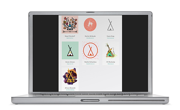


I am very excited to announce that Hand-Painted Weddings was chosen as one of 7 up-and-coming female creatives celebrating International Women’s Day on Hatch.co! It was such an honor to be chosen for this feature. For those of you that don’t know, Hatch.co was founded by a woman, Anastasia Leng, who left her job at Google to create a “a marketplace for unique made-to-order products created by a community of handpicked professional designers and makers.” Hatch is similar to Etsy but much more refined because an artist needs to qualify to sell products on this site.
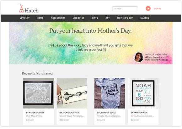
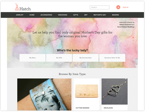
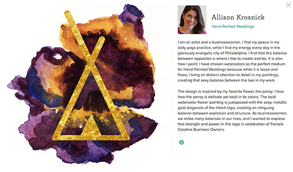
Anastasia contacted me directly to see if I’d be interested in celebrating International Women’s Day by creating an interpretation of the Hatch logo. The only stipulation was to keep the tipi intact. I was like, of course!!
I have to say that this project was one of those projects that I had a breakthrough (ah-ha moment) around midnight the day before it was due, and I was so happy with the creation that I could barely fall asleep and was still glowing with excitement for days after! After I sent the artwork to Hatch, I received a response that the team gasped when they saw it! Have I mentioned that I love my job!
I had another ah-ha moment when I was digging into the inspiration of this logo interpretation, and why it resonated so strongly with me. I am copying the blurb that is beside the logo below for readability:
“I am an artist and a businesswoman. I find my peace in my daily yoga practice, while I find my energy every day in the gloriously energetic city of Philadelphia. I find that this balance between opposites is where I like to create and be. It is also how I paint; I have chosen watercolors as the perfect medium for Hand-Painted Weddings because while it is loose and flows, I bring an distinct attention to detail in my paintings, creating that sexy balance between the two in my work.
The design is inspired by my favorite flower, the pansy. I love how the pansy is delicate yet bold in its colors. The bold watercolor flower painting is juxtaposed with the sexy, metallic gold diagonals of the Hatch logo, creating an intriguing balance between explosion and structure. As businesswomen, we strike many balances in our lives, and I wanted to express that strength and power in this logo in celebration of Female Creative Business Owners.”
I feel like I found my voice in explaining my process, which is so personal that it is hard to distinguish and put into words. I’m sure other creatives feel similarly; it is really hard to explain your creativity as an artist (where it comes from, what drives it). It makes interviews and “About” pages challenging. After yoga one day, when my head is the most clear, I realized it… I have struggled explaining who I am because I don’t really fit into a box. I am a balance of opposites (sometimes teetering), but once I saw it, I noticed the idea seemed to flow through many aspects of my life from the way I paint, to the way I work, to the way I am. I’ve got to tell you, it was a revelation.
