I have been loving practicing with my new calligraphy tools. Currently I have been using the Brause Steno nib (shown), which is also called “Blue Pumpkin” because it has a blue hue to it. (How cute is that?) And I have tried practicing with the Brause Extra Fine 66 nib. This is a very small, surprisingly flexible nib, but I am not as crazy over the smaller nib holder, so I haven’t been using it as much. I’m sure once I’m back on my feet and can start shopping fine art stores in person (rather than just online), I will find a nib holder that is a bit more comfortable for me, so I can get more use out of the EF66 nib.
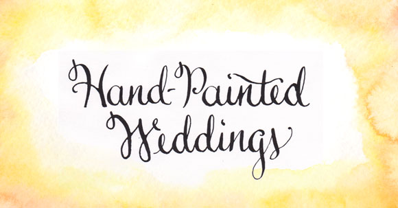
I am practicing calligraphy by copying samples of some of my most admired calligraphers in order to grasp the idiosyncrasies of each letter and to practice different styles and techniques. Then once I’m “warmed up” I usually start my own lettering, which is where I came up with Hand-Painted Weddings in calligraphy (shown above). I am definitely flirting with the idea of changing my logo to use this new type treatment. I would definitely add a watercolor element to it, but what do you think? I fear changing my logo when I have only been using my current logo for less than a year, but feel that this hand-painted version may be more authentic to my brand.
I’d love your thoughts in the Comments section if you feel so obliged!
Paintings and Calligraphy by Hand-Painted Weddings.


